I have been trying to pin down a color scheme to use throughout all the rooms in my house so they flow together and don’t feel disjointed. Since we painted the living room, dining room, and hallway Westhighland White (color by Sherwin Williams, matched to Valspar) those rooms are airy and light. The kitchen and bathroom are La Fonda Mirage from Valspar’s historic color line, and they too are bright and cheerful. Then we come to the bedroom and guestroom/office, which we did not pick the colors for.
They are two different shades of dark blue-gray. The office is darker than the bedroom by a hair. This brings the “light and airy” train to a dead halt. I’m trying to lighten the mood by using light colors in both of these rooms… the effect is working better in the office than in the bedroom. I know it takes time and energy (and money!) to create the perfect layered look so I need to be patient. But the bedroom is killing me! It reminds me of a bachelor pad… all dark grey and white with dark wood accents. Like Barney Stinson’s apartment on HIMYM.

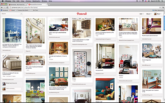
I turn to Pinterest for my design inspiration, more often than not. As I’ve written about before, I love to pull up my pinboards and look at what trends I’ve been drawn to over time, instead of sticking with just one inspiration image/room. Here are two shots of my “Personal Environment” boards–if you want to see anything in particular, just click on them to be taken to my pinboard.
What I noticed is white, white, white, with pops of bright, vibrant color. Got the bright and vibrant thing going in the kitchen and bathroom; can’t wait to accessorize more. Still working on the bright colors in the bedroom, where I am largely at a loss. Remember the pic of Barney’s room? Doesn’t even remotely speak to my pinboards, does it? This brings me to my next tool:
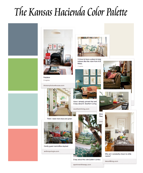
To keep myself on the up and up (and to keep myself focused on things that will “go” in my space instead of being distracted by other pretty, potentially clashy items) I created this handy little color palette for myself to print out and keep in my purse. Except be warned… the “Westhighland White” on your computer screen is a very strange, bad color, and in my “official” one it’ll be replaced with a real paint swatch.
I cannot WAIT to get some of that green and coral into the bedroom. DIYing some detail on the curtains? Maybe! Putting new pillows on the bed to go with our new duvet? Probably! Having my main colors and accent colors on hand will help me when making decisions (scenario: “But it’s on sale 50% off!” “Does it go with everything else?” “No…”). Hopefully they’ll help me get a vision for the bedroom as well. Because I’m about ready to move into the guest room with it’s happy pillows and gold frame (and computer, of course).


I love that idea! That will be really handy to have with you!
We’re actually doing something similar with the Little House, actually, color-wise. We’re doing the same pale gray with pops of apple, aubergine, and persimmon (doesn’t that sound better than green, purple, and orange?).
Haha, sounds beautiful! The screen totally distorts the color i have that’s supposed to be a warm lace white… but your pops of color with light gray will look so good! Did you decide whether or not to get that rug? ;)