Well, Stephanie is in Maui and I’m missing her like crazy. Is there a better way to get over it than to reminisce about the planning and preparation that led up to last weekend? Is it too early to reminisce?
If you’ve planned a wedding you know that invitations are crucial for setting the tone of the event and can get expensive really quickly. I’ve seen invite suites that exceed $4 per invite… if you plan on inviting 100, 200, 300 people the price can get astronomical very quickly. Lucky for me, I have some wonderful friends in the printing business. They designed and printed my wedding invites for me in 2010, and have always been patient in indulging my amateur graphic designer side by allowing me to submit my own work for them to print. Case in point: Stephanie’s wedding invitations!
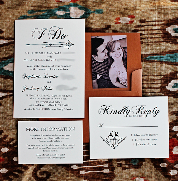
For her event, Steph wanted a simple and classy affair, and chose the color scheme “magenta with metallics.” Early in the planning process she had also mentioned working in Art Deco elements, so I took a few cues from that and created something that I think fits the bill and is unique. Do you think it fits the vision?
The paper looks pretty white on my computer screen, but FYI, it was printed on an ivory-cream stock.

I created them using Microsoft Publisher, since that’s the program I’m most familiar with. I now have the full Adobe suite on my mac and would love to learn more programs, but time wasn’t cooperative in this case. So Publisher it was. I think they turned out very nicely.

The fonts are Chopin Script, Castellar, and Baskerville Old Face… in case you were curious.
Since the invite suite was simply cream with black text (classy looking , AND cheaper that way!) We used metallic bronze envelopes to spice things up. I think it worked really nicely. We were able to print these for right around $80–including 200 invites, RSVP postcards (two sided) and the info cards. The envelopes added a bit to the cost but we definitely saved a lot of money compared to ordering suites online or out of one of those catalogs they have at print shops.
Here are some of my tips in case you’re interested in trying this out yourself:
- Look at other invites to see what kind of styles you like and would feel confident in mimicking.
- Make lots of test prints! What looks good on your computer might look very different on paper.
- Keep things simple! By limiting my color scheme to black and white, I was able to easily drop in some art deco designs I found online.
- Limit yourself to three kinds of fonts. This is a basic graphic design tip you’ll see all over the place. If you start going too crazy with fonts, things can become too busy and look more amateurish than you need to.
Have you ever designed your own paper goods? Business cards? Christmas cards?
