Take a Tour: Huyze Anna

I was totally smitten with our rental home in Bruges. It had a young, comfortable vibe and plenty of room for 5 people. When entering, the space seemed narrow but getting past the stairs, everything opened up very nicely. The stairs did seem a little precarious (not that they were wobbly, just narrow) but nobody in our group had any casualties.
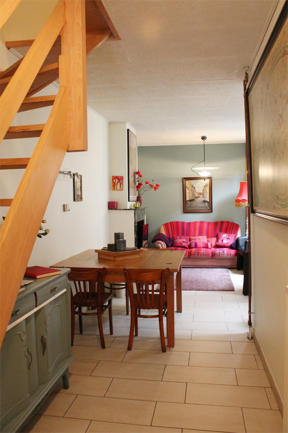
I particularly liked the huuuuuge, very old map of Bruges (I believe it was a reprint of the first official map of Bruges. You can take a peek at it in the photo above, on the right edge). Little touches like that reminded us that we were in a very old city!
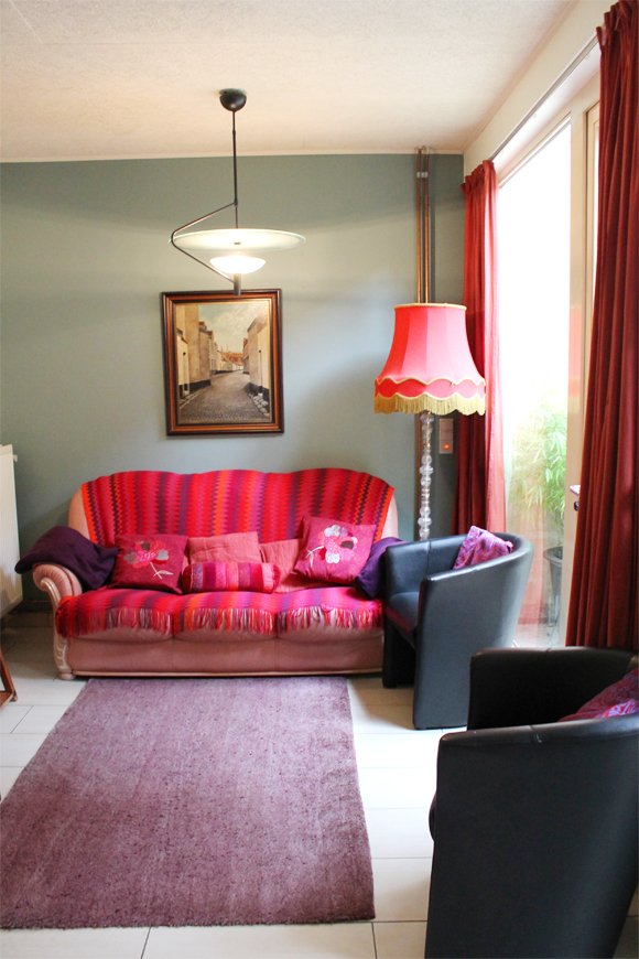
I especially liked the juxtaposition of the pink accents with the gray-greeny-blue wall. I thought accent walls were out of style? This one pulls it off very well. One thing that helped this accent wall make sense was that the blue color was carried on over into the kitchen, which was located directly to the right of the living area:
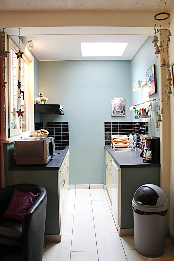
Is it crazy that I found this tiny kitchen easier to work with than our own much larger kitchen? I think it had to do with the spacious lower cabinets (eliminating the need for upper cabinets) which really maximized the counter space (the cabinets in our current house are hung too low, creating a very claustrophobic feel when using the workspace). Did I mention the fridge was tiny? There it is, tucked under the counter on the right. Wonder how that would fly in an American kitchen….
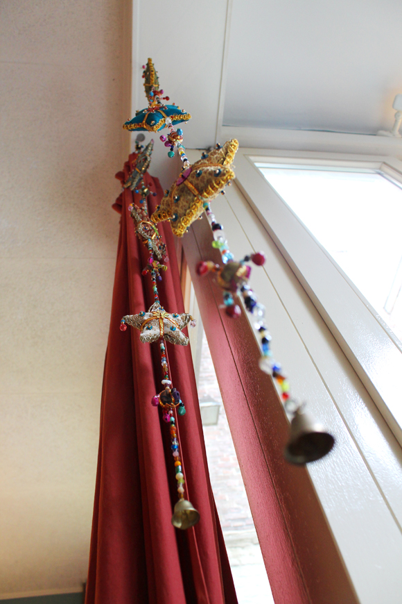
The space was very minimal–which is to be expected of a European vacation rental, naturally, although cute boho accents were everywhere.

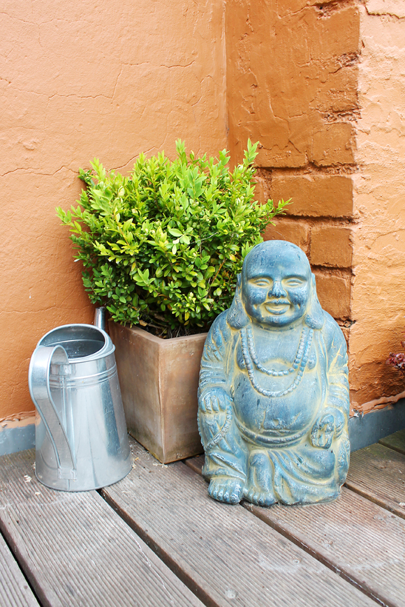
This little patio was carved out of the kitchen/living room area. It was nice to leave the door open and let in fresh air. All four walls went up 3 stories so it was very private. Most definitely outdoors, but not in the way most Americans consider an outdoor living space.

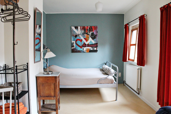
On the second floor there were two bedrooms. In the first one (with a double and a single bed) there was a shower RIGHT IN THE ROOM. Smart space-saving strategy, but very awkward. The other one had a little “room” in the hallway for the shower. All the bedrooms had a sink in them. Doug and I had the one with two beds–the twin became a dumping ground for laundry and souvenirs. My parents had the room with red curtains.

On the the third floor was my sister’s room. She got her own TV (not pictured) with an assortment of DVDs featuring Garfield and Saw. You know, family favorites.

Outside Stephanie’s room was an awesome rooftop terrace. She wins the best room award (in my opinion).

What do you think? Have you ever stayed in a vacation rental instead of a hotel? I loved it!

Need a recommendation for where to stay? Check out my Your Turn section.

Advertisement

New House (With Pictures!)

This post is extremely long. I feel like Sherry from YHL! Get comfortable!

The moment has arrived. Photos of the new house. The interior, at least. It’s been dark out while we’ve been over there working, so I couldn’t get any shots of the exterior. Those will go up next week after I take some more pictures this weekend! All of these photos were taken after mopping the floors (didn’t want to majorly gross you out).

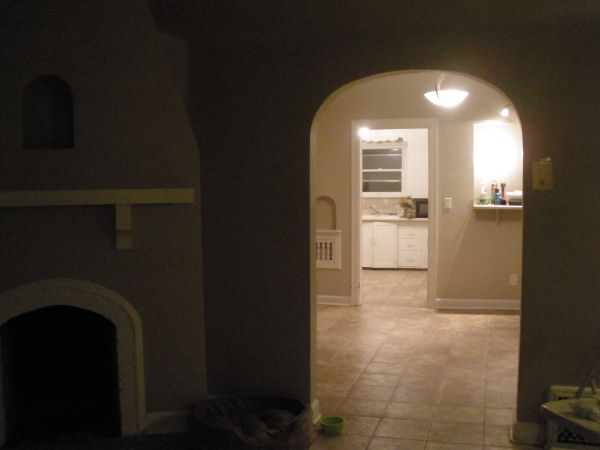
When you enter the front door, you step into the living room, with non-functioning fire place, which you can kind of see here. I can’t wait to paint everything a lighter shade and liven up the inside of the fire place with a glossy pop of color! The reason the front room light isn’t on is so you can get a better view of what lies beyond the arched doorway… the dining room, kitchen (you can see the cabinets) and small strange off-kitchen nook. The nook has a window with a high bar counter. I can envision eating breakfast there.


Here’s the living room from another angle. On the right of this picture you can see the doorway leading into the dining room, and the front door is out-of-frame on the left. What I stupidly didn’t take a picture of is the view as if you were standing by the fireplace. There are 5 windows in this room! The two on the front wall are really tall, and the 3 on the other walls are “normal” sized. Whatever normal is.

Here’s another view of the small off-kitchen and bar area, taken from the middle of the dining room. In the following photo you can see….

My doggy! And… one of our many doors for exit (we have 3). This one was painted shut and Doug had to use all of his manliest strength to open it from the outside. One of the first things to do is get our glass guy (we have a friend who does glass for a living; I love saying “our glass guy,” I hope someday I can be somebody’s “something guy” or gal) to replace that missing window. Due to the nastiness around it I assume a window AC unit used to be there. Note the breakfast bar area on the left. Getting your bearings?

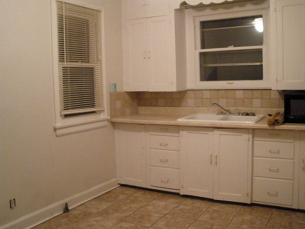
Here is the kitchen. The room isn’t small but the counter space is surely limited. Is it sad that this is an upgrade from our current apartment? I assume the refrigerator is going to go on the blank wall next to the window. There’s no other spot for it!It will be SO nice to have a double sink. The drawers are tough to open and close so we are toying with the idea of turning them in to shelves (with cabinet doors). Out-of-frame, on the left side, the wall comes back and there is a door to the basement.

Now for the second half of the house!

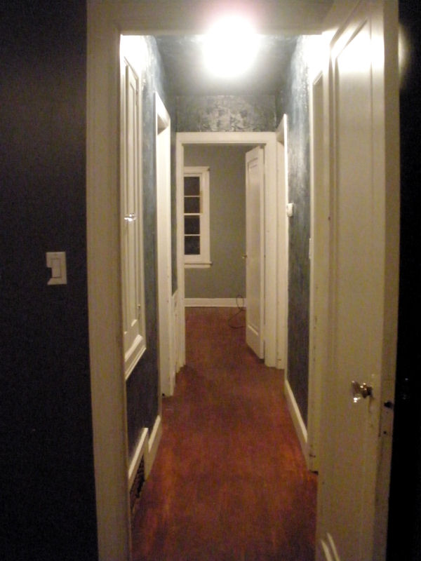
First, I’ll show you the hallway. This is taken from the front bedroom. If you go through the doorway next to the fireplace (scroll up and picture it) and make a left, you are in the front bedroom. As you look down the hallway on the left you have a small closet, and the bathroom, and at the end you have the back bedroom. On the right you have two doorways. The first leads to the living room and the second leads to the dining room. This hallway is navy blue (even the ceiling!) and absolutely abysmal.

This is the view into the front bedroom. The window that goes all the way to the floor makes me hesitant about making this the master bedroom–harder to arrange furniture– although this room is slightly bigger

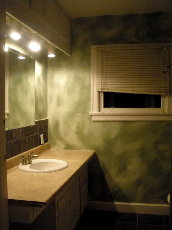
Eek! The bathroom. Look at that paint job. This room will be brightened up. I kind of hate the arch over the tub but we’ll see how it is once it’s repainted.

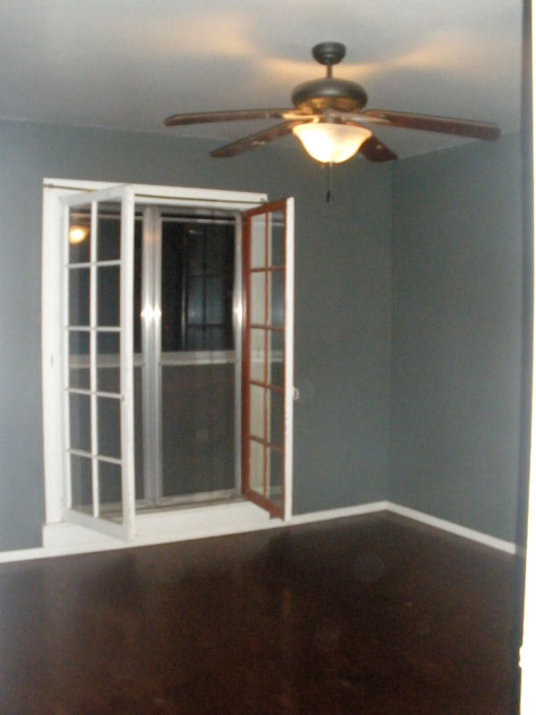
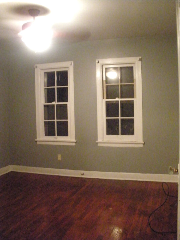
Lastly, here is the back bedroom. In my mind, this will be the master. I feel like the back of the house is safer than the front and the size of these windows lend to more interesting furniture setup (as opposed to the floor-length mirror in the front bedroom). However, this room is 11×11 as opposed to 13×11 so we shall see what we end up with.

In summary:

I am so excited over the floors in this house. So easy to keep clean. The wood is actually in quite nice shape. The smallness of the bedrooms is going to be interesting after going from our more loft-style apartment to this little hacienda-style bungalow. (You’ll see the exterior soon enough). I also have big plans for this place and I’m really excited about it.