A new winter coat… of PAINT, that is, on the outside of the WHOLE house.
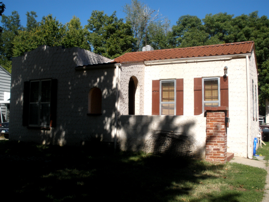
It’s a long story. Get your cup of coffee ready. When we last spoke of the outside of the house, it looked like this:

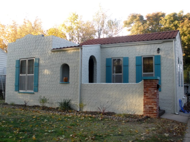
Pink-ish with burgundy-ish shutters. Classic southwest. The master plan was to patch some of the more heinous cracks in the stucco, do a little touch-up paint here and there, and paint the shutters turquoise (turquoise and pink adobe is one of my favorite combinations). Now, something happened between a month ago (pictured here) and last Saturday (see below):

Yes, the lawn looked healthier in the first photo but the temperature has done a 180 since then. And we planted some dinky little plants and made a flowerbed. Fall is here, my friends. Oh, you mean you noticed something else. Like, the whole house is a completely different color! It is now some kind of light beige-tan. Decidedly not pink adobe. Let me explain. A chunk of stucco had been taken to Lowe’s to get the match so we could just do touch-up on the stucco repair, but evidently the person at Lowe’s who was running the color match machine was either on some serious dope, or our 5-gallon bucket of paint got mixed with someone else’s. It really is a toss-up at this point. The fact of the matter is that we had our hands on a non-refundable 5 gallon bucket of the wrong color, so the consensus was just to go with it. Now, I’m not particularly fond of it compared with the previous color, but the truth of the matter is that the whole place (and garage) do look much, much nicer with a fresh, non-dirty coat of paint. And the nice thing was that the turquoise really does go well with it. So, what’s done is done.
Oh, but there’s more. We did the body of the house first (naturally). The majority of the work was done by Doug and his parents. I focused on the detail work, namely priming and painting the shutters. Using primer was a life-saver because (in one test location) the dark red zoomed right through the turquoise and looked ter-ri-ble. Yay for primer. Also, my MIL rolled all of the concrete porches with a special super-durable concrete paint and they just look fab. The dark brown is matched to our (new, functioning!) garage door which also helps pull things together.

I feel like I need an accent color going on here. Suggestions welcome. Also, I’m on the fence as far as what to do with the red exposed brick. I really like it, but it kind of stands out and feels really disconnected. Maybe the easiest/best thing to do would be to swap out the border edge (weird plaster rocks that were here when we moved in) and replace with a similar shade of red brick? That might look nice…. Oh, and one other detail to point out, I ORB’ed (the verb “ORB” is a DIY-blog buzzword for “painted with oil-rubbed bronze spray paint”) my mailbox and the outside light fixtures (you can see one of them in the wide shot on the right part of the house). They look good as new. Which is nice because the light fixtures were kind of rusty and falling-apart-y.
All in all, I am coming around to the new paint color. It helps that none of the old color is visible so I’m quickly forgetting what it used to look like.
One more thing, and I need the opinions of you, my readers on this one. I have the feeling that the place would look way good if I ORBed the gutters and drainpipes (carefully, so as not to get any paint on the new exterior or roof). I did a very amateur-looking mock-up in photoshop to see what it might look like. What do you think.
This:

or this:

Will it look hideous? or add some much-needed contrast and polish? Mind you, they’d be subtly metallic and match the mailbox and light fixtures. I think you know which side I’m on, but I will truly take into considerations any comments or suggestions.
