Free Pillow!

Last night a new decorative pillow made its debut in our house–it only took a year!

Here’s the story: we went to the Kansas City river market in, like, April of 2010 (or some absurdly distant time like that) and bought this 15 lb bag of basmati rice from an African grocery shop. It took us this long to finish the bag.

DIY steps:

  1. Use 15 lbs of rice
  2. Remove plastic bag from inside burlap one
  3. Cut off handles from the top of the bag
  4. Insert one sad, faded, depressed looking pillow from my freshman year of college
  5. Sip top closed
  6. Enjoy new decorative item!

Let There be White, Part 2

Okay. The other two rooms took longer and took more paint, but this is the real dramatic improvement. The hallway.

What once was a two-toned, navy blue tunnel of sadness…
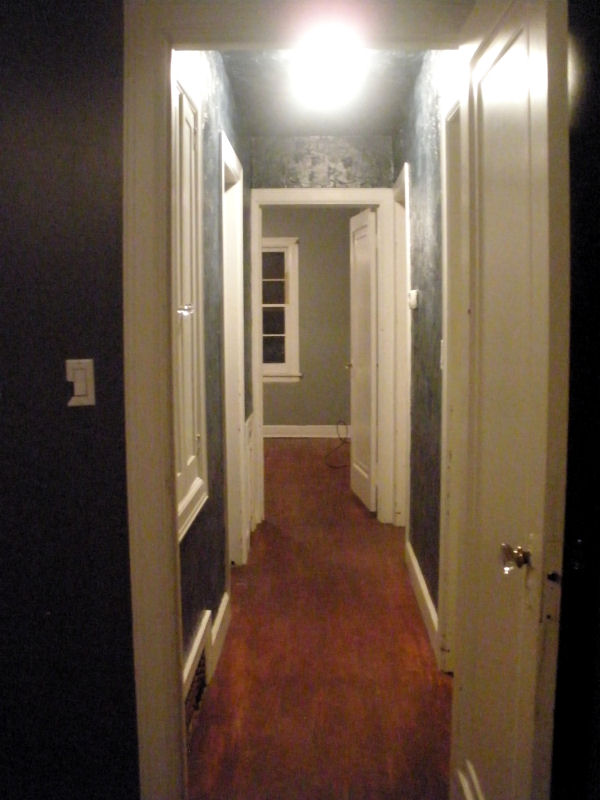
has turned into a white tunnel of not-quite-as-sad-ness. The ridiculous plaster effect cannot be dealt with, but at least with white on the walls it isn’t bad. In fact, my MIL says it looks like cake frosting–which is true, and actually makes me want to relive the success of my chocolate cake endeavor.

Here are some progress shots:
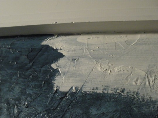
Yes, covering the blue was UH-HAWFUL!

So, several coats around the edging, two rolled-on coats of paint (with a high-nap roller to get into all that texture) and a bazillion hours of brush work (my fancy term for poking the end of the brush into all the little holes and crevices) the hallway officially resembles cream-cheese frosting.

Breaking up the grey tones of the two bedrooms with the white hallway actually makes them look lighter and less intense, making my decision not to paint those rooms much easier. With lots of white and light-colored accents the darker rooms will still fit into the cohesive “look” I’m hoping to incorporate throughout the house.

Has anyone else painted an extremely textured wall? Commiserate with me in the comment section.

Bright, Fresh Blue

The first room we tackled in the new house was the kitchen (and “kitchen part 2” room where the oven will go). We bit off a small chunk to gain some momentum and have one room under our belt before beginning the daunting project of tackling the living and dining rooms (including arched ceilings).  This was a smart move because painting the other two rooms (over the 3 day weekend) just about knocked us out. More on that another day, though.

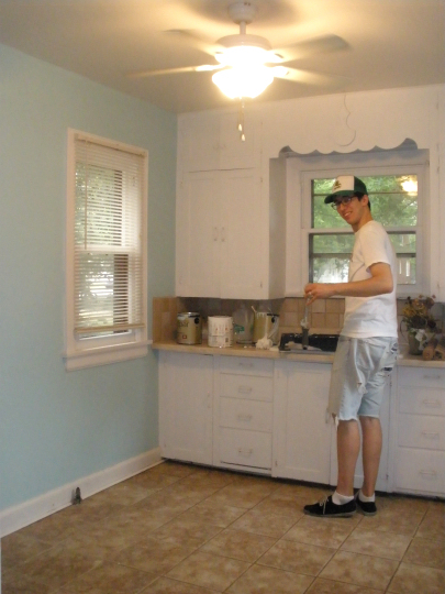
First, let’s get a little glance at the kitchen and kitchen part 2. Excuse the haziness of the photos–I feel like my camera’s quality just gets worse and worse every day. I guess I did buy it in 2008. Here’s Doug, faithfully washing out his roller (I had to get on his case about it…)

Here’s the kitchen and “kitchen part 2” from by the exterior door in the dining room. Please excuse the mess from painting and rehabbing the house–it only got worse as the weekend progressed…

In the second picture, take a good look at that light-sucking beige/taupe (in the dining room) because you won’t be seeing much more of that around these parts.

The color I chose was part of Valspar’s Historic Colors line. It is called La Fonda Mirage, and it is taken from a famous hotel in Santa Fe. I thought it would really pop once the front two rooms were painted white–it was easy to see the immediate effect even with the beige paint still hangin’ around. It’s a much crisper color in real life, very cheerful and it will be a joy to cook in a bright, light kitchen!