Alternate title: “How to Hang a Light (non-Hardwired)“
Second alternate title: “Something so Incredibly Easy I Don’t Know Why We Were Intimidated”
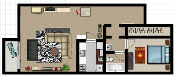
This quick and cheap (around $30) project has already made such a H-U-G-E difference in our dining zone, that I don’t care if our apartment complex dings our security deposit for the two holes we put in the ceiling. Anyway, here we go– starting with the “before” photo:

Our table is the perfect size for seating four people. Four feet in diameter, it doesn’t take up a ton of space. Unfortunately, this section of the apartment is pretty “blah.” Personally, I love the mismatched chairs with the zebra rug, but the space needed something dramatic to be a focal point and to spice up the pale tones we had going on here, namely the light wood table, light green chair in back, and white walls.
As I touched on briefly Wednesday, this side of the apartment doesn’t get a ton of light after the sun goes down–these days, that means after 4 or 5 PM. (During the day, however, the sliding glass door lets in a ton of natural light, which I’m really grateful for.) I decided that it would be awesome to hang a light over the table so that at dinnertime we can actually see what we’re eating. Oh yeah, and add a little style.
Supplies:
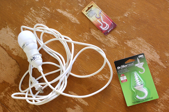
Enter the light kit we found in the as-is section of IKEA for $2. Yes, you read that right, $2. We nabbed it up and began the hunt for a suitable shade. I was really trying to get away from shopping at IKEA for everything, so we checked Target and Home Depot for shades. Okay, so it wasn’t an exhaustive search… later, we did find ourselves at IKEA and got a lampshade from them. The KILSMO, to be specific. So much for my quest to liven up my shopping destinations. Next we went to Lowe’s (which is conveniently right next door to IKEA) and grabbed two kinds of ceiling hooks: medium-duty and light-duty.
Process:
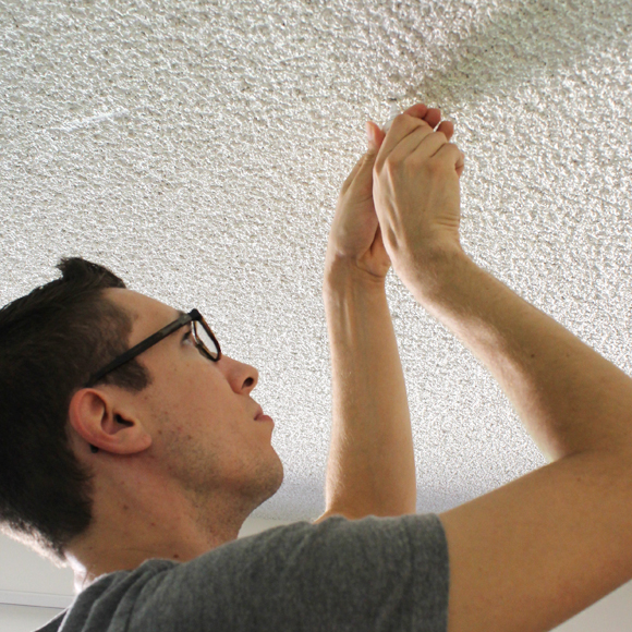
We measured the room to make sure the unit was centered evenly between the kitchen bar and the glass doors, and marked the spot on the ceiling. Then, Doug volunteered to screw the driller hook in (his height gives him an advantage). With this particular hook, we did not need to drill a pilot hole. At first it gave him some trouble but quickly it started going in tightly. Note: There were lots of other options, most of which including anchors. This one only holds 8 lbs. If you are hanging something heavier, please use one with anchors.
Then, I strung the light kit through the lampshade. This particular shade has a neat feature–it can be adjusted. The first time I strung the kit through, the light bulb peeked out at the bottom of the shade. So I pivoted the thingy (please forgive my lack of proper terminology) so that the bulb was positioned higher inside the shade. The following pictures will make more sense:
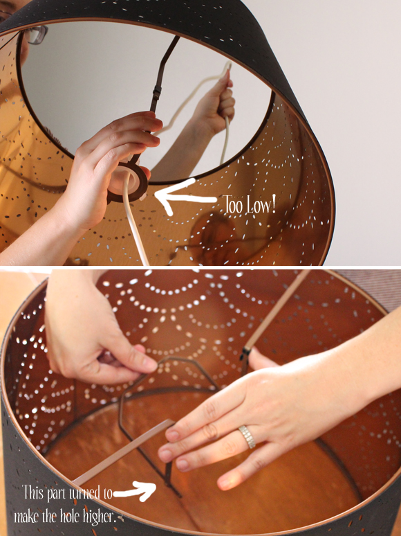
For the second hook, we selected a spot directly above the outlet we were going to plug the light kit into. The smaller hooks did require a pilot hole. After drilling that, Doug twisted the hook in. Since the main purpose of this hook is to swag the cord from draping across the room, it doesn’t bear a heavy load, and something smaller was OK. So, we pulled the light kit through the shade and strung the whole thing through the large hook, then the smaller hook–draping, or swagging, the cord (now the post title makes sense).
A good rule of thumb for hanging a pendant shade above a dining table is to aim for somewhere between 2 and 3 feet from the table to the bottom of the shade. Depending on the scale of the table and lampshade, this is a kind of fluid rule. Go with your gut. Ours is 28 inches from bottom-of-shade to table.
Before I reveal the after photo, I must confess our womp-womp moment. To get the right height, an attractive swag, and have the cord running straight down to the outlet, we, well, ran out of cord. We plan on getting a small extension cord, possibly with an in-line switch on it. For now, you can check out the “after” with our temporary fix: a janky surge protector. We will fix that issue soon but for now I can’t wait to share with you:

It is so nice to have a light in this quadrant of the room! It casts a lovely warm glow, thanks to the fabulous brass inside the shade. I love the way the dramatic black ties the zebra rug in. I feel like having this custom light addition is like jewelry on the room. And it was SO EASY!


