I meant it last Thursday when I said that a bathroom is a good place to take a risk. And I’m going to take a BIG risk today and do something ultra themey. Many designers turn up their noses at themey rooms, and rightly so, as I believe they’ve had their heyday and today’s rooms lean more towards a cohesive “house-story” (I just made that up but it sounds so HGTV) with nods to certain themes here and there.
But you know what? What’s life if you can’t have any fun, and why do I blog if I can’t put something together like this? It has been bouncing around in my head for weeks!! I can see it really working in a hotel, a rental, a public space… anywhere where people don’t spend long periods of time is OK to go a little more over the top than normal, and make it memorable.

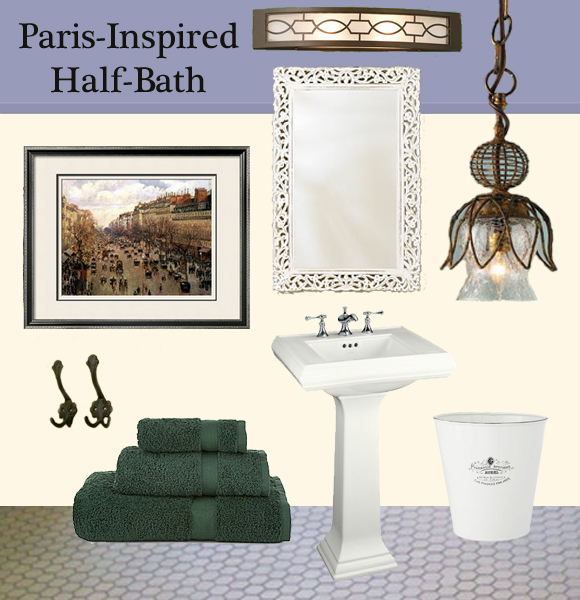
Walls: The paint colors are inspired by what makes Paris stand out among so many other European Cities… the more-or-less uniform paint colors on building façades imposed by the Haussmann renovation. Really, look at most photos of Paris (especially the city center) and these tones will prevail. Not to mention they look so lovely with wrought-iron or other dark metal playing off of them. I don’t have paint color recommendations but look for a smoky purply-blue (but with prevailing gray tones) and something pinkish gray-tan (almost a weathered limestone color). I would paint the ceiling of the room (that’s right! Paint the ceiling!) with the purple-gray and bring the color down onto the walls about 12 to 18 inches. I’d paint the rest of the room with the tan. A purple-gray molding along the line where the colors meet (I tried to give the impression of this on the inspiration board) would be a lovely touch.
Floor: I’d go with your classic small hex tile on the ground with gray grout. Gray grout will hide dirt and prevent the inevitable depression felt when once-white grout looks dingy. Additionally, the gray highlights the white classic hex shape. This style of tile has been around for hundreds of years and is not going away anytime soon… timeless is definitely the right word. And, it is so affordable!

Sink: The pedestal sink was inspired by what I saw when I looked at the bridge in the above picture. I thought, “those thick columns would make a killer sink.” Since I’m impatient, I did not find a sink exactly like them, but it’s close enough to make me happy. (Also, yes, every half-bath needs a toilet, but you’re on your own for that one…)
Lighting: Here I have selected two different lights: a 24-inch sconce for above the mirror, and a hanging mini-pendant one for additional light. You’d wouldn’t want to put these too close together, but I like how they “go.” They are very different styles (square vs. organic) in the same finish on purpose. If you get two that are too similar, but slightly different it will look like you tried too hard and didn’t quite get it right. These two both lean toward art nouveau which helps tie them together. They look like they were plucked out over the years and give a good eclectic layer.
Mirror: The lighting and hooks (and sink and door hardware, if you can swing it) would ideally be a dark bronze or cast iron color, so there’s no need to darken up the space with a dark mirror frame. This one from World Market brings the Marché aux Puces look in. Since this is a half bath, a normal mirror will do; no need for a medicine cabinet. Make sure the mirror is not too close to the wall color. Darken or lighten with paint (a drybrush technique would be ok) as necessary.
Cast Iron Hooks: Anchor the light paint colors with dark finishes like the dark aged bronze lighting and these art nouveau cast iron hooks.
Wastebasket: This cute little French Apothecary wastebasket would fit right in.
Art: Skip the Eiffel Tower nick-knacks and look for some more subtle Paris-themed artwork. Things were starting to look really cold in here. Bring in this warm-toned Camille Pisarro print and have your own little piece of the Musee d’Orsay. Art.com can even send it to you framed and matted as shown.
Towels: Dark green is another unofficial color of Paris. From the famous metro entrances to the booksellers’ booths on the Seine, it is a great accent for the tan and gray-purple. For hand towels, stay away from anything too jungle-y, and get the darkest, deepest green possible.
None of the online stores linked to here have provided any compensation for this post; I’m sure they don’t even know this blog exists!


