Barney Stinson’s Apartment

Over a year ago, I posted about creating a cohesive color scheme for our last house. I lamented the dark gray walls, gray quilt and dark brown wardrobe as looking too masculine, and I name dropped “Barney Stinson’s Apartment” from How I Met Your Mother–in all it’s gray-on-gray-on-gray glory. Surprisingly enough, in the past year I kept seeing “Barney Stinson” apartment-related terms show up under search terms that bring people to my site…. 197 times in total, to be precise.

So, it is official–I must please the masses and come up with an inspiration board based on Barney’s bachelor pad. To be honest, this was a really fun exercise for me, because as I’m sure you know, my friends, this is not my style. Sure, I have a dark gray mid-century modern couch, but I am pretty sure the similarities end there.

I started by looking at screen grabs from the show, which included his living room, bedroom, and kitchen. The color scheme is obvious: grays, metals, and a bit of brown here and there. The set designers on this show really got into the mind of the suit-wearing confirmed bachelor and committed to the motif. There are very few decorative pieces (especially when contrasted with Lily and Marshall’s eclectic abode). Let’s be honest–if his apartment was an outfit, it would be a designer three-piece suit. Here is where I ended up:

Barney Stinson's Apartment

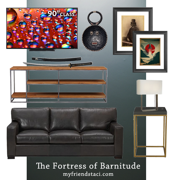
The Paint: Unfortunately, I do not know what color the set designers chose. I do know that Farrow and Ball’s “Down Pipe” is the deep-gray of the moment around the blogosphere, and it seems fitting for this room. Benjamin Moore’s “Dark Pewter” qualifies as runner-up. Design Star Emily Henderson has a list of her favorite gray paints (with a healthy dose of Ryan Gosling) which may also be helpful.

The Couch: While the couch on TV is dark gray (choose “smoke” as color option–pictured), I would have selected a deep brown leather (amaretto) to break up the all-gray party!

The Tables: Barney’s side tables and coffee table feature the same look–metal straight lines with a wood or glass top. Cubes or rectangular box shapes are the key here. Men–you are in luck. This design is everywhere right now. The ones I chose are from CB2–console and side table. IKEA also has some similar options.

The TV: Sure, it’s not a 300-inch screen, taking up an entire wall, but at 90 inches–yes, that’s 7.5 feet–diagonal, this Sharp Aquos LED TV is one of the biggest on the market.

The Extras: Man-cave decor like Samurai swords or tribal masks make the man seem adventurous, while the few art pieces that hang on the wall are reminiscent of quirky movie posters or book covers. The Voyage and Lord Vader Prints from Society6. Duo table lamp from Room & Board.

Extra Credit: If you are in the market for Stinson-approved bedding, you are in luck. If you want your tabletop to reflect the motif, these are the dishes for you.

This was fun–I may make a series of inspiration boards inspired my my favorite TV sets. For more of my inspiration boards, click here

Advertisement

My Dream Office

Sorry I didn’t get a post up yesterday (my loosely-adhered to schedule is MWF). I was going to continue that sentence with a “but it’s because I…” excuse, but I don’t have any! I spent yesterday cleaning up after having a friend over this weekend and ordering our family Christmas cards.  One of the nice things about being a blogger is being able to set my own schedule… and that includes staying up late at night putting together my dream office on Pinterest!

Quiana at Harlem Love Birds has touched on the idea of multiple profit centers and I love the idea. Perhaps you could call it restlessness,  but I have always liked multitasking and the idea of doing a few different jobs (some from home) has appealed to me more and more in the past year or two.

And if that’s the case… well then, don’t I need a fabulous office to spend my waking hours in?

I daydreamed about it all day, then I went on the internet and pulled all the elements together, and now I’m ready to show the world! …Of course, in my fantasy, I have a whole room to set my office up in, instead of my current nook.

Desk: I love the sturdy simplicity of this Crate & Barrel Sentry work table. I know that according to Pinterest, bloggers should have white parsons desks, but I think the medium-toned wood would hide scuffs and dings better, and continue looking good for the long haul.

Chair: I have been pining away for this West Elm Spindle chair for months, and it is currently marked down. Perhaps I should me-gift it to myself sooner rather than later…

Supply cart: I’ve checked out this IKEA RÅSKOG in person– it seems sturdy and the wheels roll smoothly. The teal color is just beautiful. It will be perfect for holding note cards, design catalogs, and other items that would otherwise clutter up my desk top.

Couch: I will use the couch given to me by my grandma. The one pictured is similar. (This will allow us to get a more nap-friendly couch for the living room).

Storage Cases: I have long promised myself that when I have an office, my college textbooks (which I can’t bear to part with) will live in a smart-looking storage setup like this. I’ll keep books in the bottom part and pretty seasonal decor items in the top part, ready to be pulled out and distributed around the house on any whim.

Rug: I have had my eye on this fluffy Istanbul rug for some time now. I am not a shoe-wearer if I can help it, and I think the yummy texture would be just the trick to keep my creativity flowing.

Paint: It is so hard to tell paint colors over the computer screen, so I’m not going to tell you what brand and shade this yellow is. To pick the perfect color, the best plan of action is to buy a couple test pots and paint swatches in the room. Evaluate how it looks with other items and make your decision after careful consideration.

Accessories: Curtains, Clock, Nespresso machine (wink), Rifle Paper Co. calendar, Sputnik Chandelier, Art.

I think in an office like this, I could be very productive indeed!

PS: If you want an inspiration board to get the ball rolling on a room of your own, be sure to check out the Design Services page! 

Bohemian Direction

I got a great question (from my mom) in the comment section on last week’s State of the Home post.

What kind of vibe are you going for in the new place? Will you keep the eclectic mid-century/urban look, or go for something else?

It has been a real head-scratcher as to why I can’t seem to catch my last place’s mojo and infuse it into the new place. I have the same furniture and the last place had all white walls. Should be easy to translate to an all-white apartment, right?

Wrong.

I know I shouldn’t be so hard on myself. We just moved in three weeks ago? Anyway I was trying to put my finger on it and I realized a few things.

  1. The old place was oozing architectural details–the fireplace, vaulted ceilings, arched doorways, to name a few.
  2. The old place was broken up in a much more chunky way.
  3. With lots more windows (see #1) there was more opportunity for texture- like lots of different curtains and the bamboo shades.
  4. While I thought the last place was dark (and it was compared to our light-soaked loft apt) this place is even darker! In order to put a positive spin on it, I’m going to call it “moody.”

Instead of clinging to the light and airy eclectic-meets-mid-century-mod feel of the old place (what a mouthful!), I think I need to make a slight shift to the bohemian side of things. Obviously I can’t just ditch all the existing furniture, but I can reuse items in ways that seem more laid-back and incorporate more fabrics–getting more creative than just curtains on windows to add texture, and bring in more aged objects (maps, etc). I live in California now, after all, I should be able to find tons of old hippie cast-offs at area thrift stores.

Naturally, I turned to Pinterest for inspiration. I have written before about my technique. I do not look for inspiration by searching Pinterest for a key word, nor do I look at old pins, but I look at what I have pinned in the past and what images I am still drawn to even now, a few months or even a year later.

I have a bright white dresser acting as buffet/sideboard–it is the first thing one sees when entering the apartment. Gotta soften that corner somehow. I also have three bright white bookcases now (post coming on those soon!). So the place is leaning a bit towards “mod” at the moment and I need to lean it back toward “boho.” There: a goal has been set.

Images: Please click through for the full tours and much more!

  1. Giovan & Chloe’s Handmade Honeymoon Home on Apartment Therapy
  2. Tommy & Todd’s Bohemian Chic Collection on Apartment Therapy
  3. Michael’s Masculine & Modern Open Studio on Apartment Therapy
  4. Justina Blakeney’s Bohemian Bedroom <$1000 
  5. A room Julianne Moore decorated, photo linked by Emily Henderson

So, in conclusion: 

  • I’m going to fill up the walls.
  • I’m going to find some kind of awesome brass accent.
  • I’m going to dial down the colors a bit from bright to muted.
  • I’m going to hang way more curtains than necessary.
  • I’m going to layer rugs on top of carpet.
  • I’m going to get a plant and try to keep it alive!
  • I’m going to make the open layout work for me not against me!

And with that, I have created myself a compass to look at while making decisions! Do you have a decor compass you use when you’re stumped?