Bohemian Direction

I got a great question (from my mom) in the comment section on last week’s State of the Home post.

What kind of vibe are you going for in the new place? Will you keep the eclectic mid-century/urban look, or go for something else?

It has been a real head-scratcher as to why I can’t seem to catch my last place’s mojo and infuse it into the new place. I have the same furniture and the last place had all white walls. Should be easy to translate to an all-white apartment, right?

Wrong.

I know I shouldn’t be so hard on myself. We just moved in three weeks ago? Anyway I was trying to put my finger on it and I realized a few things.

  1. The old place was oozing architectural details–the fireplace, vaulted ceilings, arched doorways, to name a few.
  2. The old place was broken up in a much more chunky way.
  3. With lots more windows (see #1) there was more opportunity for texture- like lots of different curtains and the bamboo shades.
  4. While I thought the last place was dark (and it was compared to our light-soaked loft apt) this place is even darker! In order to put a positive spin on it, I’m going to call it “moody.”

Instead of clinging to the light and airy eclectic-meets-mid-century-mod feel of the old place (what a mouthful!), I think I need to make a slight shift to the bohemian side of things. Obviously I can’t just ditch all the existing furniture, but I can reuse items in ways that seem more laid-back and incorporate more fabrics–getting more creative than just curtains on windows to add texture, and bring in more aged objects (maps, etc). I live in California now, after all, I should be able to find tons of old hippie cast-offs at area thrift stores.

Naturally, I turned to Pinterest for inspiration. I have written before about my technique. I do not look for inspiration by searching Pinterest for a key word, nor do I look at old pins, but I look at what I have pinned in the past and what images I am still drawn to even now, a few months or even a year later.

I have a bright white dresser acting as buffet/sideboard–it is the first thing one sees when entering the apartment. Gotta soften that corner somehow. I also have three bright white bookcases now (post coming on those soon!). So the place is leaning a bit towards “mod” at the moment and I need to lean it back toward “boho.” There: a goal has been set.

Images: Please click through for the full tours and much more!

  1. Giovan & Chloe’s Handmade Honeymoon Home on Apartment Therapy
  2. Tommy & Todd’s Bohemian Chic Collection on Apartment Therapy
  3. Michael’s Masculine & Modern Open Studio on Apartment Therapy
  4. Justina Blakeney’s Bohemian Bedroom <$1000 
  5. A room Julianne Moore decorated, photo linked by Emily Henderson

So, in conclusion: 

  • I’m going to fill up the walls.
  • I’m going to find some kind of awesome brass accent.
  • I’m going to dial down the colors a bit from bright to muted.
  • I’m going to hang way more curtains than necessary.
  • I’m going to layer rugs on top of carpet.
  • I’m going to get a plant and try to keep it alive!
  • I’m going to make the open layout work for me not against me!

And with that, I have created myself a compass to look at while making decisions! Do you have a decor compass you use when you’re stumped? 

Loving the Living Room

Well, slowly but surely, I’m continuing to make my way around the house for my room tours. Just in time to move.

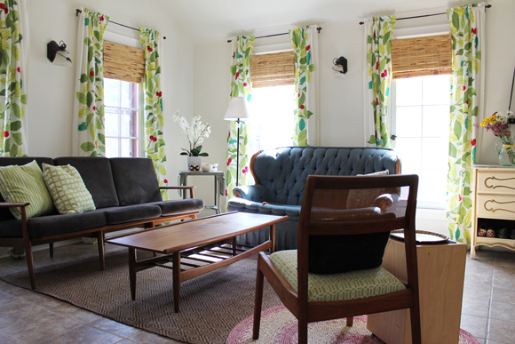
The living room, while the most energy-inefficient room in the house (several degrees above/below the other rooms, depending on the season) is my favorite room in the house. It’s gotta be because of the IKEA curtains I had my heart set on for quite some time.

Here’s a little secret: with four windows, curtains can add up very fast. These IKEA beauties weren’t cheap at $60 per set (I mean, that’s not a ton but more than curtains at Target would be). Since the windows were so small anyway, I thought a whole panel would look a bit strange on each side of the window. Things would get really heavy really fast. Do you see where I am going with this? I cut each panel up the center and hemmed them, thereby making 8 panels from 4. Making that first big irreversible cut was so hard to bring myself to do! I’am really happy now, though. The bamboo blinds came with the house and I hated them until we got the curtains up, and now I love them. Isn’t life funny?

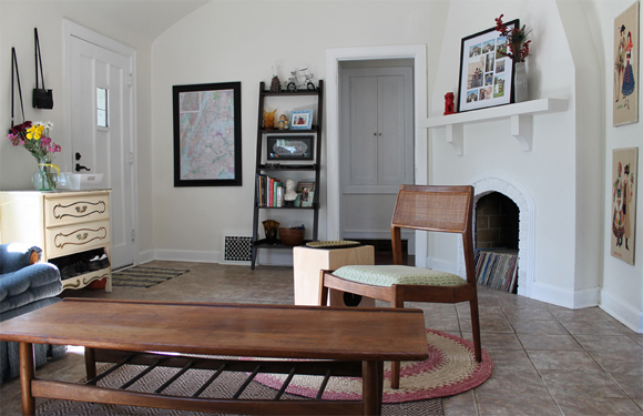
When we first toured the house we were to move into, I had visions of making everything white to look like whitewashed adobe walls you’d see in interiors of the southwest. So, that’s what we did! I feel that it helps the walls seem cooler and with the numerous but relatively small windows the room has, I needed light to bounce around as much as possible. So, with several coats of white on the walls, I was determined to infuse color into the room using textiles, art, and furniture, and prove to myself (a color addict) that a white room can be colorful!

The mantel proved more challenging than I originally thought it would be, since it’s pretty shallow. I know it looks deep in the next picture, but trust me there isn’t really room to layer objects (like Emily Henderson’s recent video recommends).  Behind that large frame is a little cut-out, with a bumpy, non-functioning outlet in the bottom of it that makes it impossible to use as a showcase for doodads… yep, so we just covered it up. I like the height that the frame gives to the all-white fireplace, and it was a good opportunity to showcase some wedding pictures as well.

These photos are from the time I shot my home tour (in March?) but not much has changed. I have done some rearranging here and there, and I finally painted the inside of the fireplace in with flat black, and we sort-of-but-not-really finished the dresser by the front door. Another post for another time, that.

Sources:

  • Blue couch, free. My, my, my. This blue couch has been passed down through several dorm rooms, to Lisa (my old roommate) and now to us.
  • Gray couch, free, reupholstery, $130. Last summer we drove to St Louis for our anniversary and then made a hop on over to the town where my dad grew up in Illinois (and where my grandma still lives) to pick up this bonafide family heirloom. The cushions (original to the 60s or 70s) were pretty rotted out so we got brand new cushions in a cool gray microsuede we picked up at Hancock Fabrics on clearance.
  • Coffee Table, Goodwill. Refreshed from a pretty sorry state.
  • Sofa table (holding the TV & Playstation), handed down to me when a neighbor passed away [not shown].
  • Side chair, free, plus materials for my first reupholstery project.
  • Side table (gray), got used when our alma mater had a garage sale. Side table (wood), is actually a drum!
  • Entryway dresser, Goodwill–repainted using house paint (the same color as the guest room). Only two of the drawers were usable so I transformed the bottom section into a shoe catchall!
  • Rugs, both natural fiber from World Market. The circle one from 2005 and the jute one from last fall.

When my in-laws recently decided to list the house for sale, I was pleased that the realtor agreed to just use the photos I’d taken of each room for my house tour on the listing. My first foray into real estate photography! If I want to get serious, I’ve gotta get a wider-angle lens, but I told him to pass my name along to any other agents in the office if they liked my photos! 

For a whole house tour, click here, and for other room details, you can check out the guestroom, bedroom, and bathroom!

Madeline Kids’ Room

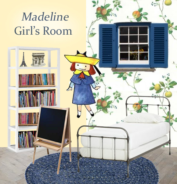
For my final post in Paris Week, I’ve pulled inspiration from a children’s book series (and TV show) that takes place in Paris. The lovable heroine who lives in a house covered in vines… Madeline!

Wallpaper: Well, the beginning of the poem says that the house is covered in vines, and if you watch the video you will notice the walls inside have wallpaper on them… I have combined those two aspects with this wallpaper. To keep it from getting too crazy, I only wallpapered one wall, and plucked a pale yellow out of the pattern for the other walls. This is so outside of my comfort zone, but is perfect for a feminine girls’ room while at the same time staying away from Pink Overkill (like all the Pottery Barn Kids girl’s rooms suffer from).

Floor: Here I’ve got a limed hardwood, which is totally gorgeous but I know isn’t that common. Regardless, you can see how a builder-installed, neutral-colored carpet would look with an area rug on it creating a central “play zone.”

Shutters: Growing up, I had shutters on the inside of my windows and I thought it was the coolest thing in the world. Functional or non-functional, placing these deep blue shutters on the window (in the middle of the wallpapered wall, nonetheless) breaks up the pattern and adds architectural interest. Even if they don’t open and close, they’re sure to add “age” to the room and make the girl who lives here feel like she’s been transported to France.

Bed: In Madeline, the girls live in a boarding school, and the 12 beds are all matching hospital-style iron beds. This one is a twin size (as opposed to a toddler bed) and the classic design will never go out of style, which is perfect for the girl to adapt with as she grows and tastes change. Better yet, if there are two girls who share a room, the multiple twin beds can even more closely imitate the book ;)

Bedding: Classic white completes the “boarding school” look and, since there is no color, can be bleached when kids get anything on it. Bring in dark red or navy blue accent pillows, if you’d like.

Rug: I chose this braided rug for durability and cushion. The navy blue color adds a much-needed dark dimension to the room and plays up the blue shutters. I went with a denim or tweed look (instead of solid navy) to add another layer of texture and visual interest. Juxtaposed against the feminine wallpaper and with classic furniture, the denim rug does not look too “country.”

Easel: The girl who lives here has a wild imagination. When not pretending she lives in Madeline’s house, she loves to be creative and the easel provides a place to corral art supplies and a large work surface for drawing with chalk or painting (the other side has paper on it).

Bookcase: Naturally, any child who chooses to theme a room around a storybook character must be really into books. This Parsons tower is pricey, but provides ample space for books and toys, and will never go out of style. It can adapt to any room in the house, so in my mind it’s a worthy investment. In this inspiration board I loaded it up with kids’ books and a few Paris-inspired models. 

Think back to when you were a child. What character would you base a room on?

My other Paris-inspired inspiration boards focused on a half-bath and a balcony